티스토리 뷰
Flex box
- 요소들을 정렬하기 가장 편한 방법
- 정렬을 하기위한 요소의 부모요소에게 선언을 합니다.
.flexbox {
	display : flex;
	/* flex | inline-flex */
}
flex-direction
- 가로, 세로 정렬 방향을 정하는 property
- main-axis와 cross-axis의 방향이 따라 가게됩니다.
- flex-direction : row -> 가로 방향으로 정렬
- flex-direction : row-reverse -> 가로 반대 방향으로 정렬
- flex-direction : column -> 세로 방향으로 정렬
- flex-direction : column-reverse -> 세로 반대 방향으로 정렬
.flexbox {
	display : flex;
	flex-direction : column;
	/* default flex-direction : row */
}
https://developer.mozilla.org/ko/docs/Web/CSS/flex-direction
flex-direction
flex-direction CSS 속성은 플렉스 컨테이너 내의 아이템을 배치할 때 사용할 주축 및 방향(정방향, 역방향)을 지정합니다.
developer.mozilla.org
flex-wrap
- flex-wrap : warp; -> 자식 요소 사이즈가 부모 요소 사이즈보다 크면 자식사이즈를 유지하며 한줄로 정렬이 아닌 내려가게 됩니다.
- flex-wrap: nowarp; -> 자식 요소 사이즈가 부모 요소 사이즈보다 커도 한줄 정렬이 되고 부모 요소 사이즈안에 자식 요소들을 넣기 위해 자식요소 사이즈가 줄어듭니다.
.flexbox {
display : flex;
flex-direction : column;
flex-wrap : warp;
/* default flex-wrap : nowarp*/
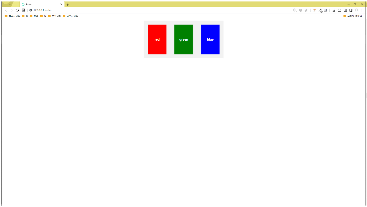
}.test-container {
background-color: #f2f2f2;
margin: 0 auto;
width: 400px;
display: flex;
}
.test-container div {
text-align: center;
margin: 20px;
width: 150px;
height: 150px;
line-height: 150px;
font-weight: bold;
color: white;
}
.test-container__red {
background-color: red;
}
.test-container__green {
background-color: green;
}
.test-container__blue {
background-color: blue;
}
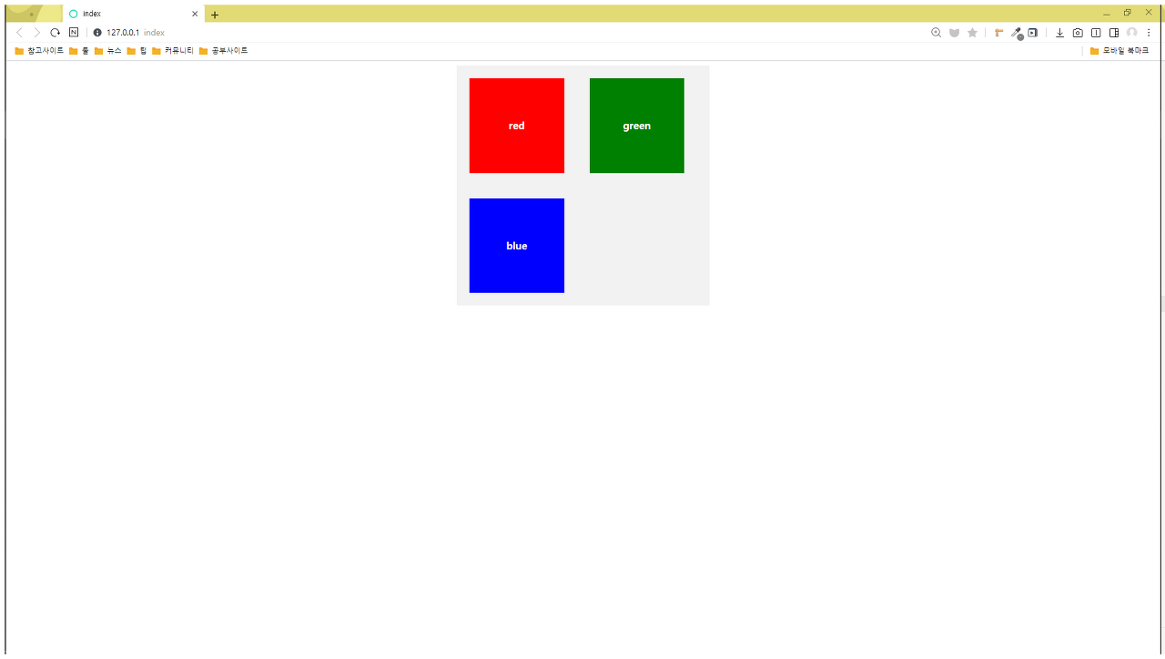
.test-container {
    background-color: #f2f2f2;
    margin: 0 auto;
    width: 400px;
    display: flex;
    flex-wrap: wrap;
}

.test-container div {
    text-align: center;
    margin: 20px;
    width: 150px;
    height: 150px;
    line-height: 150px;
    font-weight: bold;
    color: white;
}

.test-container__red {
    background-color: red;
}

.test-container__green {
    background-color: green;
}

.test-container__blue {
    background-color: blue;
}
justify-content
- main-axis의 방향에서 정렬을 하기위한 property
https://developer.mozilla.org/en-US/docs/Web/CSS/justify-content
justify-content
The CSS justify-content property defines how the browser distributes space between and around content items along the main-axis of a flex container, and the inline axis of a grid container.
developer.mozilla.org
align-items
- cross-axis의 방향에서 정렬을 하기위한 property
https://developer.mozilla.org/en-US/docs/Web/CSS/align-items
align-items
The CSS align-items property sets the align-self value on all direct children as a group.
developer.mozilla.org
align-content
- flex-wrap : wrap; 의 경우에만 사용이 가능하다.
- 전체 큰흐름의 cross-axis축을 기준으로 정렬하게 된다.
https://developer.mozilla.org/en-US/docs/Web/CSS/align-content
align-content
The CSS align-content property sets the distribution of space between and around content items along a flexbox's cross-axis or a grid's block axis.
developer.mozilla.org
*
https://d2.naver.com/helloworld/8540176
'CSS' 카테고리의 다른 글
| 📃 Typography (0) | 2020.11.09 |
|---|---|
| 👍 Media Query - 반응형 웹 만들기 (0) | 2020.11.09 |
| Position (0) | 2020.11.06 |
| Float (0) | 2020.11.05 |
| 🗃 Box Property - display (0) | 2020.11.05 |
- Total
- Today
- Yesterday
- 프론트엔드
- node.js
- function
- JavaScript
- vue예제
- 리액트
- 프론트엔드면접
- 오물오물
- CORS
- 공공데이터포털
- vue
- 개발자회고
- VanillaJS
- inline
- nodejs
- postman
- react
- axios
- CSS
- vue3
- baegofda
- font-family
- 프론트엔드회고
- INPUT
- 공공데이터
- 생활코딩
- vue입문
- 노드JS
- HTML
- cssom
| 일 | 월 | 화 | 수 | 목 | 금 | 토 |
|---|---|---|---|---|---|---|
| 1 | 2 | 3 | 4 | 5 | 6 | |
| 7 | 8 | 9 | 10 | 11 | 12 | 13 |
| 14 | 15 | 16 | 17 | 18 | 19 | 20 |
| 21 | 22 | 23 | 24 | 25 | 26 | 27 |
| 28 | 29 | 30 | 31 |