티스토리 뷰
Position
- 요소를 원하는 위치에 자유롭게 이동시키기 위한 property
- static | relative | absolute | fixed | sticky
- top, left, bottom, right 를 사용하며 위치 시킬 수 있습니다.
- top & left, top & right, bottom & left, bottom & right 등의 조합으로 사용
- 사용한 property의 교차점 기준으로 계산을 합니다.
static
- position : static;
- 모든 요소의 기본 position
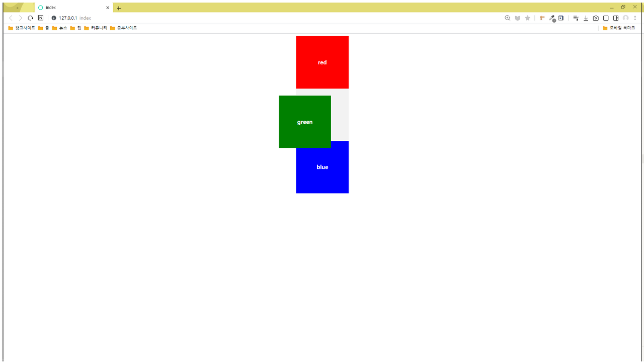
relative
- position : relative;
- 본래 본인 위치를 기준으로 부모요소에서 떠있으나 위치를 기억하며 움직입니다.
<!DOCTYPE html>
<html lang="ko">
    <head>
        <meta charset="UTF-8" />
        <title>index</title>
        <link rel="stylesheet" href="./styles.css" />
    </head>
    <body>
        <div class="test-container">
            <div class="test-container__red">red</div>
            <div class="test-container__green">green</div>
            <div class="test-container__blue">blue</div>
        </div>
    </body>
</html>
.test-container {
background-color: #f2f2f2;
margin: 0 auto;
width: 150px;
}
.test-container div {
text-align: center;
height: 150px;
line-height: 150px;
font-weight: bold;
color: white;
}
.test-container__red {
background-color: red;
}
.test-container__green {
background-color: green;
position: relative;
top: 20px;
right: 50px;
}
.test-container__blue {
background-color: blue;
}
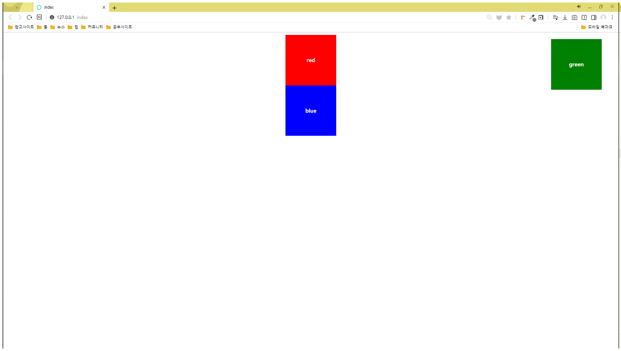
absolute
- position : absolute;
- position이 static이 아닌 부모요소를 기준으로 위치합니다.
- 부모요소에서 떠나며 본래 위치도 사라지게 됩니다.
.test-container {
    background-color: #f2f2f2;
    margin: 0 auto;
    width: 150px;
}

.test-container div {
    text-align: center;
    width: 150px;
    height: 150px;
    line-height: 150px;
    font-weight: bold;
    color: white;
}

.test-container__red {
    background-color: red;
}

.test-container__green {
    background-color: green;
    position: absolute;
    top: 20px;
    right: 50px;
}

.test-container__blue {
    background-color: blue;
}
.test-container {
    background-color: #f2f2f2;
    position: relative;
    margin: 0 auto;
    width: 150px;
}

.test-container div {
    text-align: center;
    width: 150px;
    height: 150px;
    line-height: 150px;
    font-weight: bold;
    color: white;
}

.test-container__red {
    background-color: red;
}

.test-container__green {
    background-color: green;
    position: absolute;
    top: 300px;
}

.test-container__blue {
    background-color: blue;
}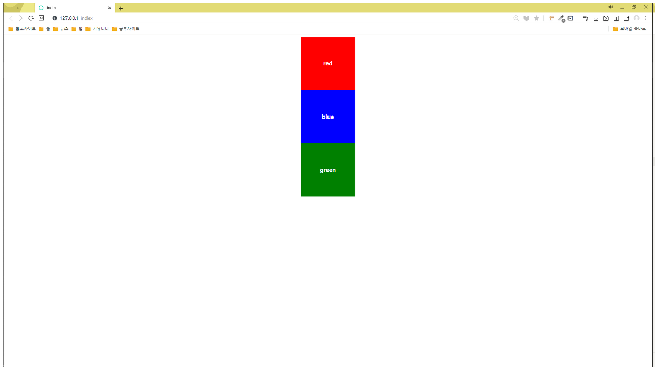
fixed
- 사용자의 viewport를 기준으로 고정되어 움직입니다.
.test-container {
    background-color: #f2f2f2;
    margin: 0 auto;
    width: 150px;
}

.test-container div {
    text-align: center;
    width: 150px;
    height: 150px;
    line-height: 150px;
    font-weight: bold;
    color: white;
}

.test-container__red {
    background-color: red;
}

.test-container__green {
    background-color: green;
    position: fixed;
    bottom: 0px;
}

.test-container__blue {
    background-color: blue;
}
'CSS' 카테고리의 다른 글
| 👍 Media Query - 반응형 웹 만들기 (0) | 2020.11.09 |
|---|---|
| 💡 Flex box (0) | 2020.11.06 |
| Float (0) | 2020.11.05 |
| 🗃 Box Property - display (0) | 2020.11.05 |
| 🎁 CSS에서의 Box Model ? (0) | 2020.11.04 |
- Total
- Today
- Yesterday
- CORS
- function
- postman
- 프론트엔드면접
- node.js
- cssom
- font-family
- INPUT
- vue
- 개발자회고
- 프론트엔드
- nodejs
- 공공데이터포털
- vue입문
- react
- JavaScript
- 오물오물
- CSS
- baegofda
- HTML
- 공공데이터
- inline
- VanillaJS
- vue예제
- axios
- 리액트
- 생활코딩
- vue3
- 노드JS
- 프론트엔드회고
| 일 | 월 | 화 | 수 | 목 | 금 | 토 |
|---|---|---|---|---|---|---|
| 1 | 2 | 3 | 4 | 5 | 6 | |
| 7 | 8 | 9 | 10 | 11 | 12 | 13 |
| 14 | 15 | 16 | 17 | 18 | 19 | 20 |
| 21 | 22 | 23 | 24 | 25 | 26 | 27 |
| 28 | 29 | 30 | 31 |